Website + eCommerce: Website: Front End Menu: Website Editor
Purpose
This document covers the basic usage and settings of the website editor in the Website application of Odoo 15. This document is lengthy - use the following bookmarks to jump to a specific section.
Getting Started
To get started, navigate to the Website application.
Once there, click go to website.
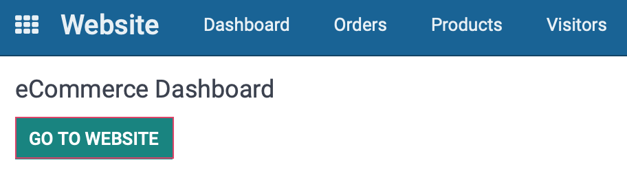
This takes you to the home page of your customer-facing website.
Important!
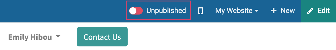
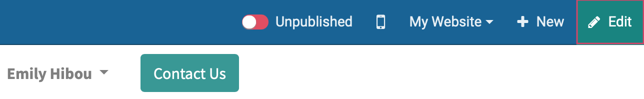
Is it Published?
You must publish a page in order for it to be visible to the public. You can easily determine if a page is published by looking at the top-right of the customer-facing page.
Unpublished
Published
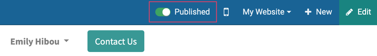
Simply click the button to toggle the state of the page. It's also good practice to open the page in a private window (Ctrl or Cmd + Shift + N in most browsers) and try to view it there.
Edit Panel
For the next steps, you'll need to enable the editor. To do so, simply click the Edit button on the top-right of any customer-facing page.
After a few moments, you'll see a new panel on the right-hand side of your page. Let's first review the options at the top of that panel.
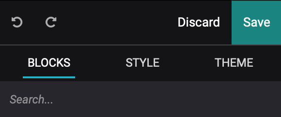
Undo: Click this icon revert your most recent change.
Redo: Click this to revert your most recent undo action.
Discard: Any changes you've made to the page since its last save will be discarded.
Save: Any changes you've made to the page since its last save will also be saved.
Blocks, Style, and Theme: These options display different items in the pane below. We'll cover these each in theor own section further down in this document.
Search: Use this to search through the preset blocks, styles, and options.
Site Theme
Important!
Site Themes are Global
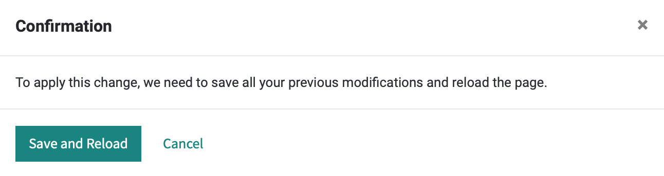
Any changes made in the Theme menu will apply to your entire website. Often when making changes in this panel, Odoo will need to save existing changes and reload the page. You will be prompted for approval each time.
Within the editing panel, click the Themes tab. Here you'll see configuration as it relates to your site as a whole. It has several sections, which we'll cover below.
Theme Colors
Odoo makes it easy to apply your colors to the website from one place. Just click each circle to add your brand colors with a HEX or RGB code, or manually. If you'd like suggestions, click the Palette icon to cycle through some preconfigured combinations.
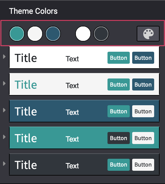
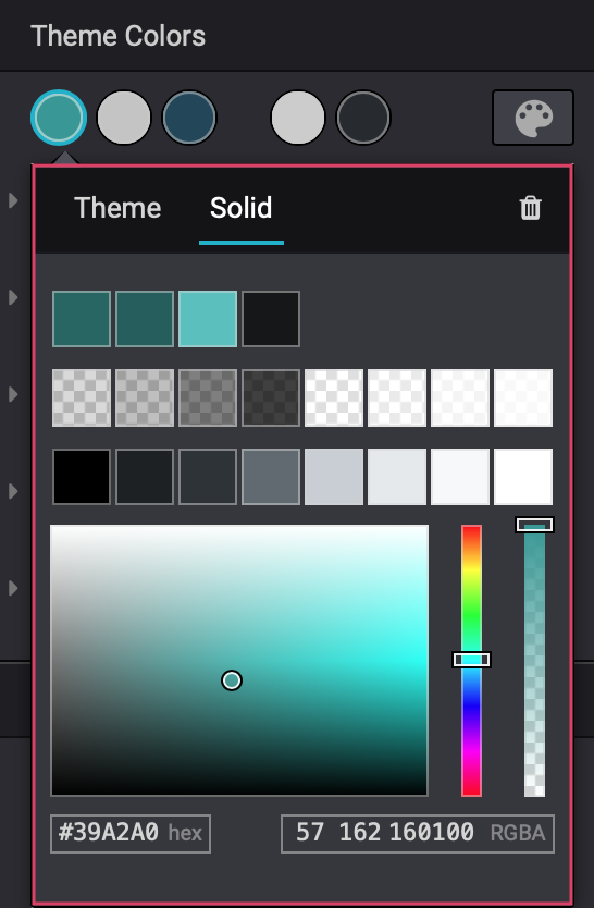
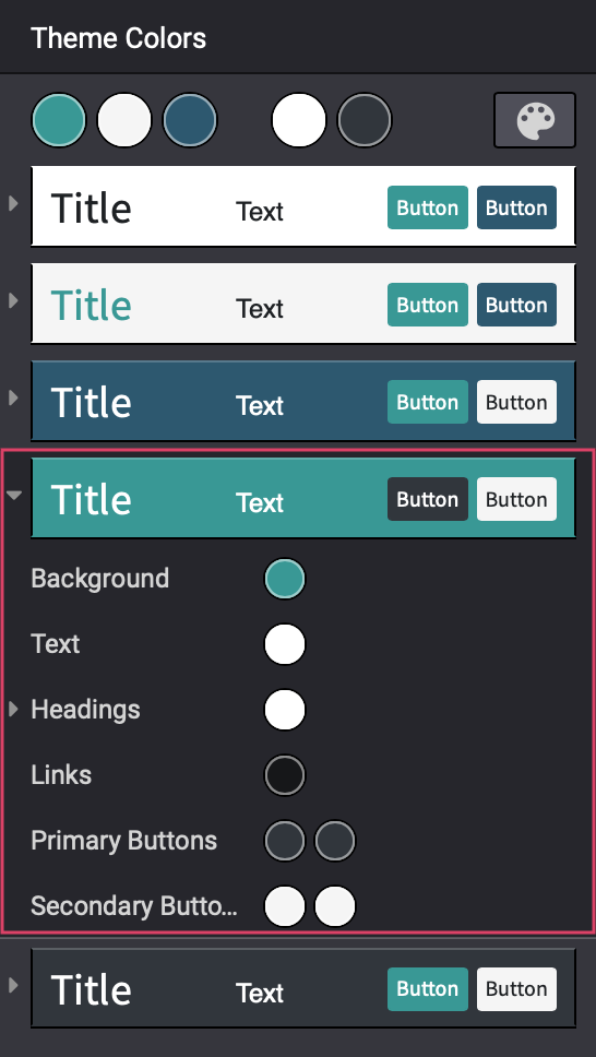
In the next five sections, you see all the different combinations in which Odoo will display your colors, using each color as a background. This panel allows you to customize each scenario for best results by simply clicking the icon on the left and modifying individual settings. This unique option ensures that you won't run into text that's too light or too dark for the background it's on.
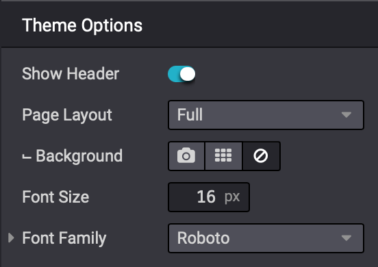
Theme Options
This section helps to fine-tune the feel and layout of your site.
Show Header: You can toggle this on/off to display the header bar (where your logo is).
Page Layout: Indicates the width of your page content as full, boxed, framed, or postcard style.
Background: Select from image, pattern, or none.
Font Size: Select the default paragraph font size.
Font Family: Select the default font family. Expand this section to select different font families for headings and buttons. These are Google fonts. If you don't see the Google font you're looking for you, you have the option to "Add a Google Font" from this drop-down menu.
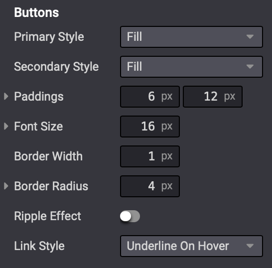
Buttons
This section stylizes the buttons on your website.
Primary Style: For primary buttons (shown as the first button in the theme colors section), select from a solid fill color, or an outlined button.
Secondary Style: For primary buttons (shown as the second button in the theme colors section), select from a solid fill color, or an outlined button.
Paddings: The amount of space to add between the text and the edge of the button (vertical x horizontal).
Font Size: The font size for buttons.
Border Width: If your buttons have outlines, indicate the width in pixels.
Border Radius: To round the corners of your buttons, enter the radius in pixels.
Ripple Effect: Toggle this on to add the ripple effect, where a different color radiates from the center of the button outward when clicked.
Link Style: Indicate if you'd like the text on buttons to be underlined and in which state.
 +
+
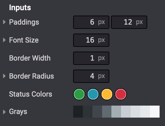
Inputs
This section stylizes the inputs on your website. An input is a form field, such as a selection button, a drop-down, or a text box.
Paddings: The amount of space to add between the text and the edge of the input (vertical x horizontal).
Font Size: The font size for inputs.
Border Width: If your inputs have outlines, indicate the width in pixels.
Border Radius: To round the corners of your inputs, enter the radius in pixels.
Status Colors: Indicate default status colors for your inputs. The order of colors is Success, Info, Warning, and Error.
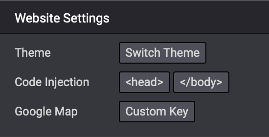
Website Settings
This section is useful for web designers working on your site. It allows them to make some changes directly from the front end.
Theme: You can use the Switch Theme button to take you to the admin side of Odoo where you can select a new theme in your website's settings.
Code Injection: If you need to add javascript, HTML, or CSS code to your website you can do it here. For code that must be added to your website's header, click <head>. For code that must be added to the website body before the closing tag, click </body>. Each option will bring up a window where you can paste your custom code.
Google Map: To use Google Maps on your site, you must obtain a key from Google. To add your code, click Custom Key. This setting can also be found in Website settings in your Odoo admin area.
Blocks
Block Types
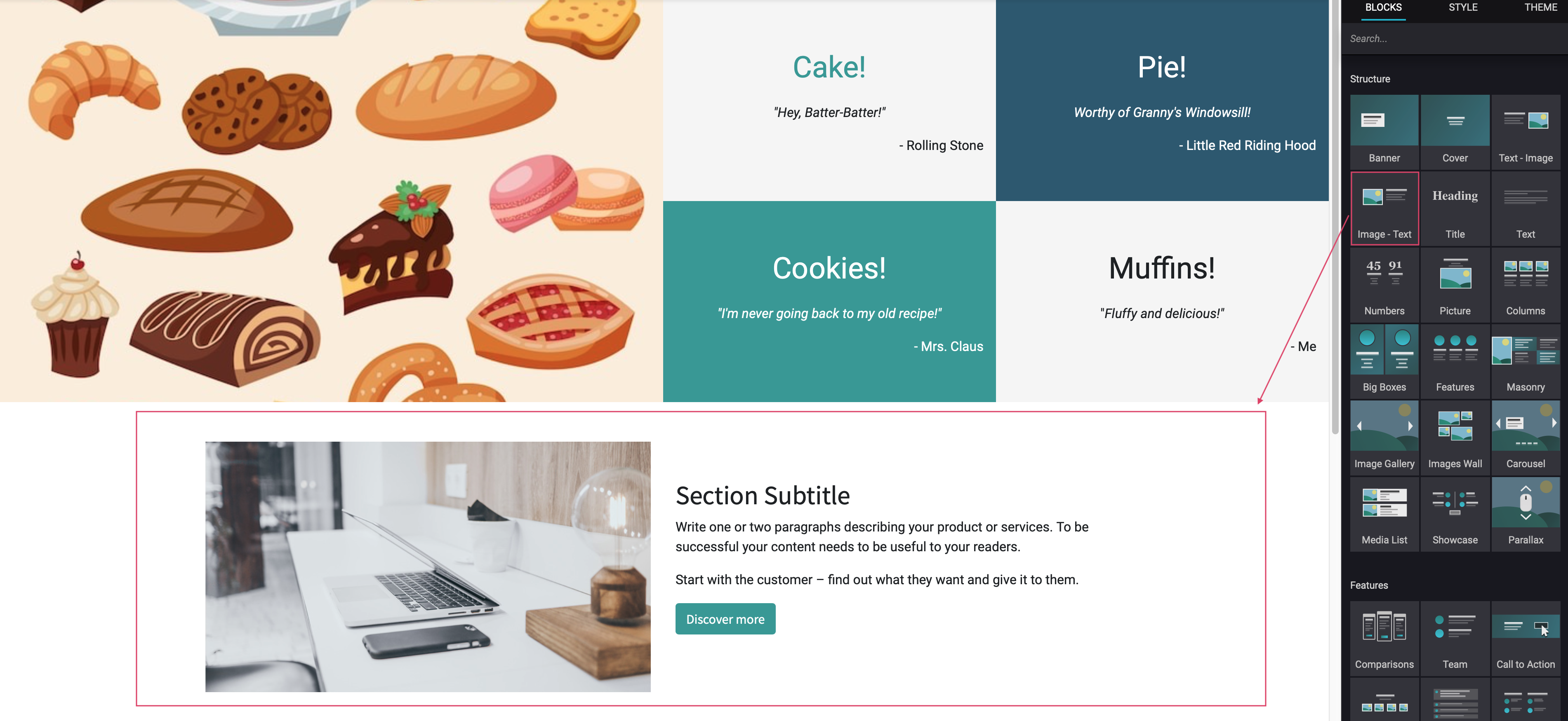
A block is a preformatted section that can be dragged and dropped over to your web page for further configuration. It's comprised of four different sections that are common to all Odoo themes. It's important to note that custom themes may also add sections to this tab.
Click the Blocks tab on the editor.
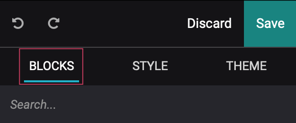
This displays the different sections below.
Structure: These blocks will create website sections, and we encourage you to try them all out on a test page to really see what each can offer. Note that you cannot put a structure within a structure; you can only put Inner Content blocks into a Structure block. This will cover further down in the instructional document.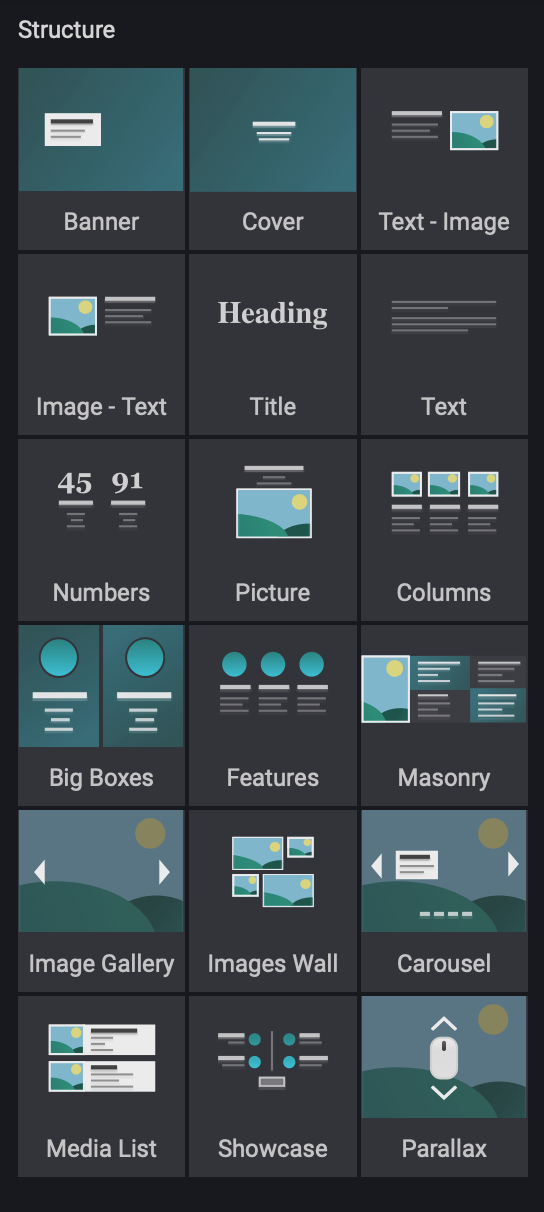
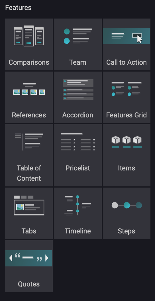
Features: These are structures that are pre-formatted for specific use-cases. The content in these blocks must be manually entered and maintained.
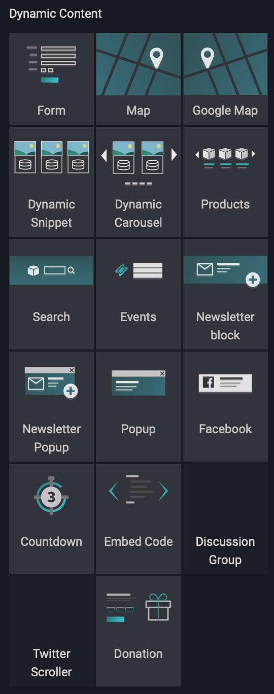
Dynamic Content: These are a mix of structures and inner content. You won't know what each is until you attempt to drag it into your page. The content of these blocks is dynamic, meaning it will auto-update based on the data it pulls from (e.g. Viewed Products) or the options it's configured within the Options tab (e.g. Countdown).
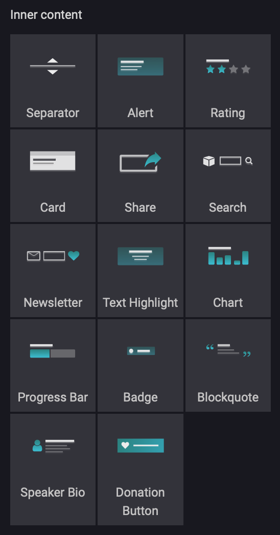
Inner Content: These blocks must be placed within a structure
Placing a Block
To place a block, click it and drag it over to the section that reads "DRAG BUILDING BLOCKS HERE". If you wish to insert a block in between other blocks, hover with the block until you see a blue highlighted section. Once placed, the block will appear with example text and you can edit it from there:
Block Selection
Keep in mind that blocks are made up of inner content, so it's important to pay attention to what you're selecting. The editing pane makes it easy to discern which settings are displaying in a drill-down fashion.
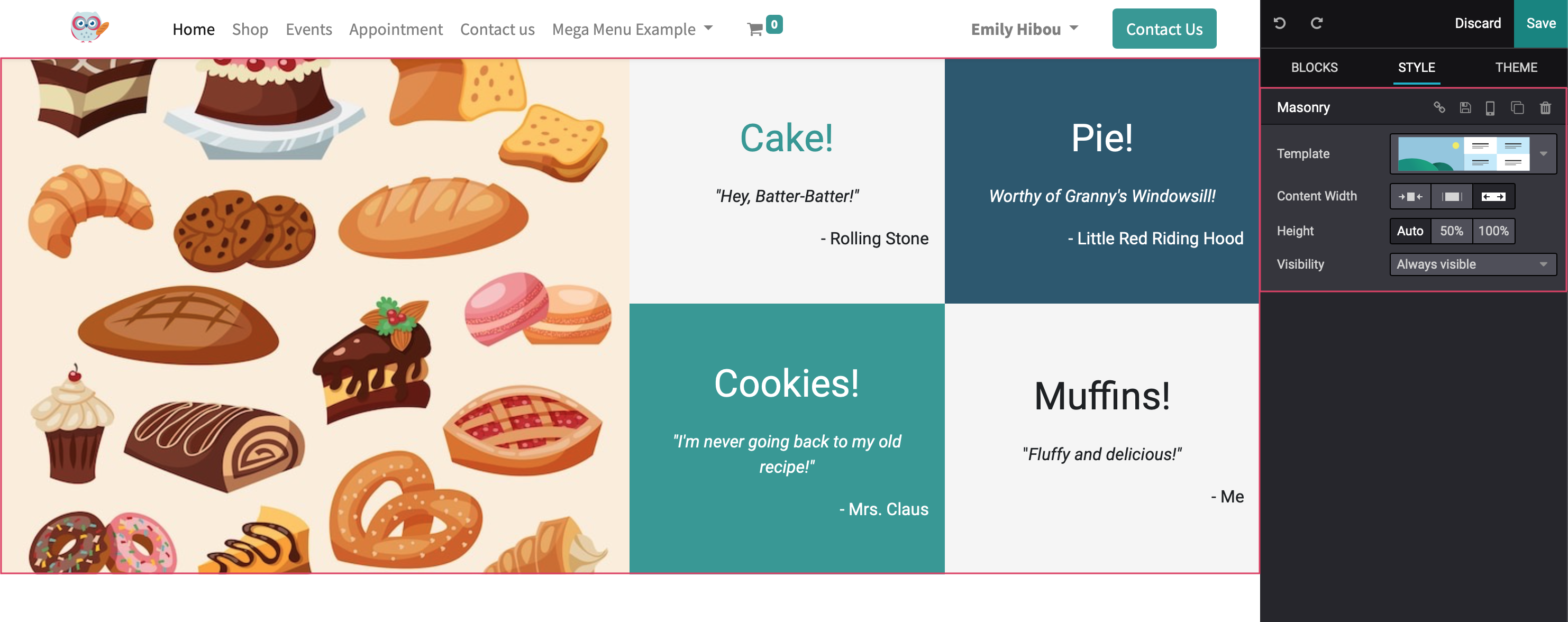
Customizing these blocks will open the Style section of the Editor, giving you the options shown below:
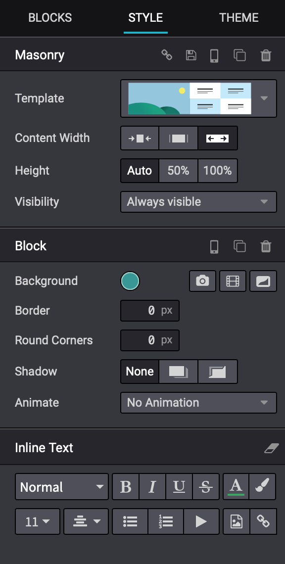
Here, we've selected an Inner Content Block that is within a Masonry style block. The settings on the bottom-most section of the right-hand pane correspond with the selected item.
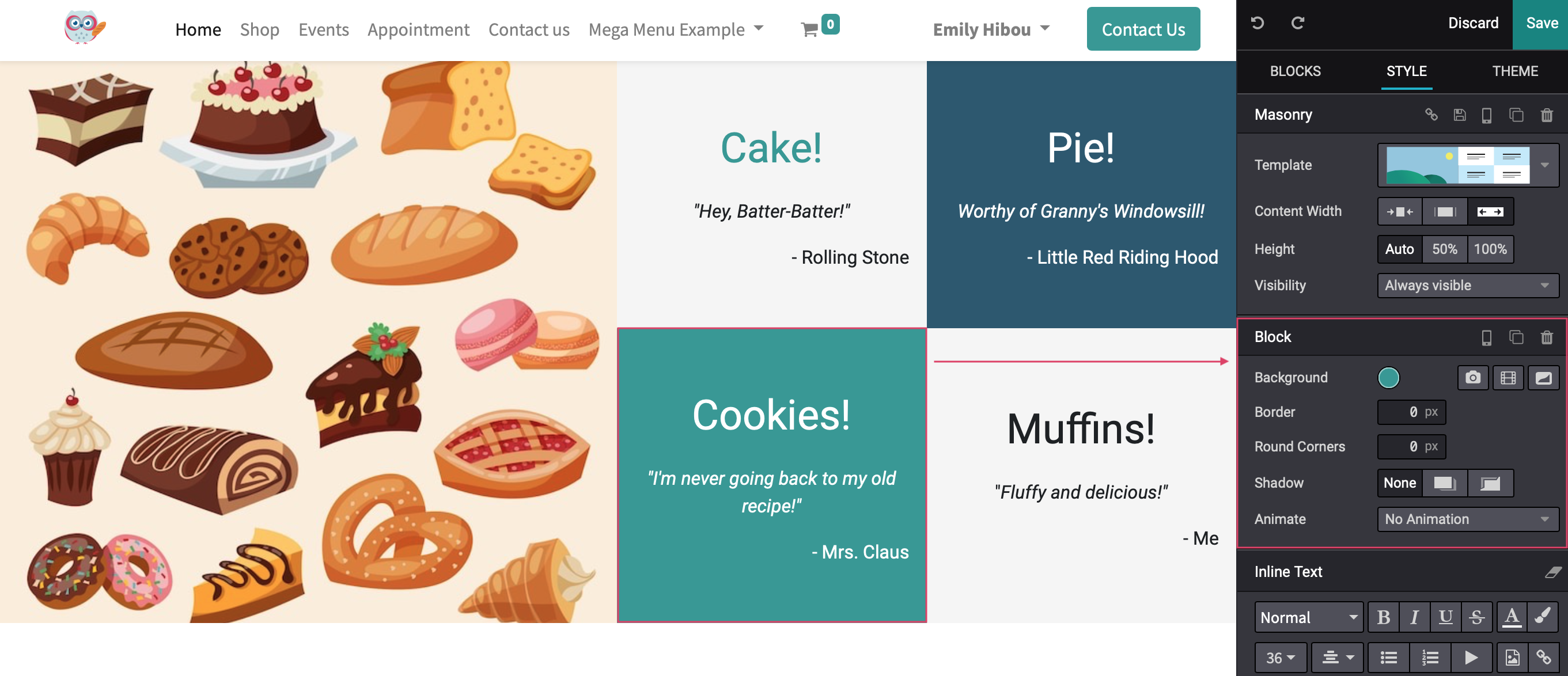
And, if we click the Masonry header on the right - or select the masonry object on the left - that then becomes the bottom-most section of settings. In this case, there is nothing containing the masonry block, so there is only one section of settings on the right.
This helps you keep track of what level of the main block you are editing.
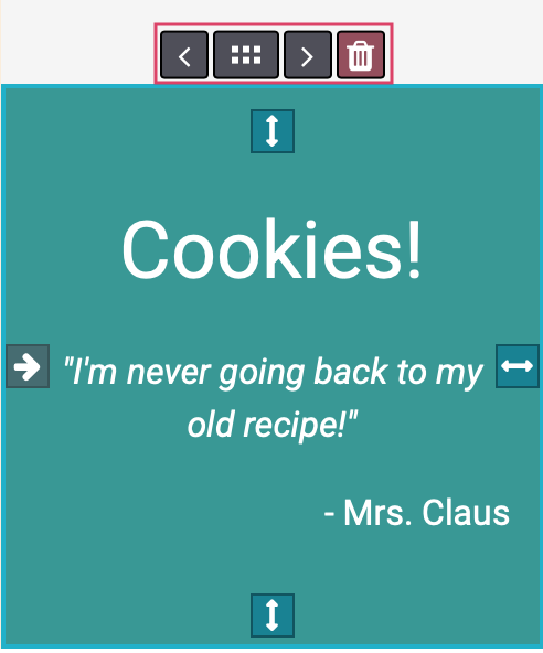
Block Controls
When draggable elements are selected, the following controls will display where applicable:
 Swap Left: Swaps position with the item to the left within the same column.
 Handle: Use this to move the block to another location on the page.
 Swap Right: Swaps position with the item to the left within the same column.
 Delete: Deletes the selection. Note that deleting an item in a column won't always leave an empty space. Instead, it may just shift its contents.
Block Options
To the right of each main block, you'll see some added features.
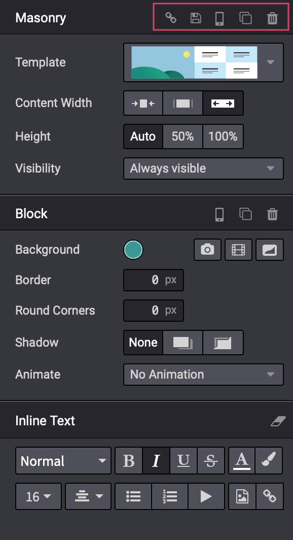
Copy Anchor Link: This will copy the link directly to this block to your clipboard. This is useful if you want to provide the URL to this specific section of a page. You'd simply provide the URL of the page, then add this copied anchor link to the end.
Save: This will save the configuration of this block for future use. Once saved, you'll see it on your Blocks panel in a new Custom section.
Visible On Mobile: This will alert you which blocks are visible to those visiting your website via a mobile device.
Clone: This will duplicate the block just below the original selection.
Delete: This will delete the corresponding block.
Block Styles
Style sections will be different from one block to the next, simply because they contain different features.
Some common style options are as follows:
On the Master Block Level
Template: This shows a small example of the template's layout. Some blocks offer a dropdown menu that will show the different variations of how that block can be organized.
Content Width: There are three preset options you can set for the content width of the selected block: small, regular, and full.
Height: Adjust the height of the selected block to auto, 50%, or 100%.
Visibility: This option allows you to set parameters for when this block of the website is visible to visitors. (e.g. if you have a tiered membership or subscription program, you could set certain users to see a different variation of the website)
On the Inner Content Block Level
Background: Below are the different ways you can customize the background of a particular block.
Color: Click to select a preset or custom color. You can apply transparency if desired.
Image: Click to upload an image to serve as the background. This option will open up a further configuration for the image placement, filter, size, and behavior. Click the icon again to remove the image.
Video: Click to upload or embed a video to serve as the background. This option will open up a further configuration for the image placement. Click the icon again to remove the video.
Shape: Odoo 15+ has sets of preformatted shapes that you can add to your blocks. They use colors from your selected theme. When selected, you can also flip the shape and change its color combinations
Round Corners: If you want to soften the edges of your blocks on the website, you can do so here and go by pixel width.
Shadow: If you would like to add a bit of depth to your blocks, you can chose from these shadow options.
Animate: You can also add a looped animation to your webpage if you so choose.
Inline Text Level
This lowest section will have all of your text customizations for the block you are editing.