Maintenance: Reporting
Purpose
This document covers the reporting options within the Maintenance application of Odoo 15.
Process
To get started, navigate to the Maintenance app.
Click on Reporting > Maintenance Requests.
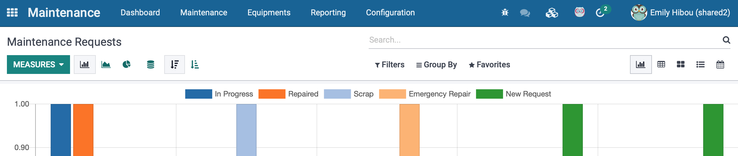
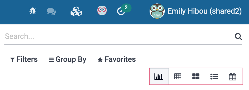
There are many ways to view the maintenance history on this page and we will go through each one. It should be noted that by default, the information will be presented in the Graph View, so we will start with the options there, and then go through the remaining views.
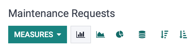
Graph View
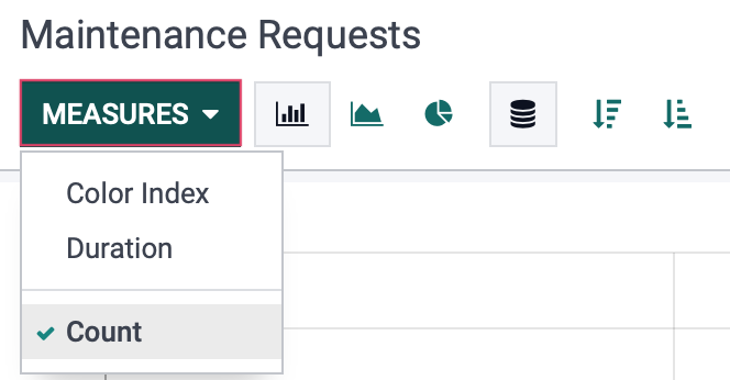
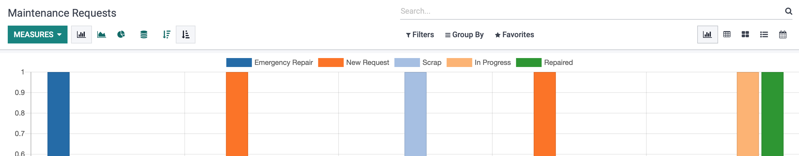
Start by clicking on Measures and you will see that by default the Count measurement will be selected. Also by default, you will be looking at the Bar Chart in the Stacked View. We will use the count measure for this document, but remove the stacked view. Take note that you can view the information while in Graph View to see data displayed using Color Index (using the color key shown in the image above), or by Duration, which is the length of time for the request to be completed.
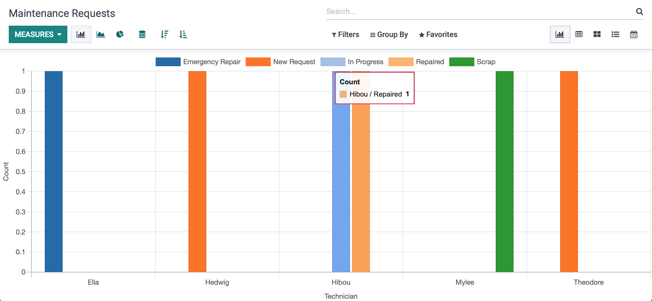
Count will show you how many requests have been completed by each user, separated by color, in accordance to the color key at the top of the screen. Hovering over the bar with show you more details of the request.
The information can then be further organized by using the following buttons:
Bar Chart: As demonstrated in the image above, the bar chart of the Count measure will present a table populated on the Y/vertical axis with the number of requests, and along the X/horizontal axis with the technician assigned to the request.
Note: This chart can be further modified to view in either descending or ascending order.
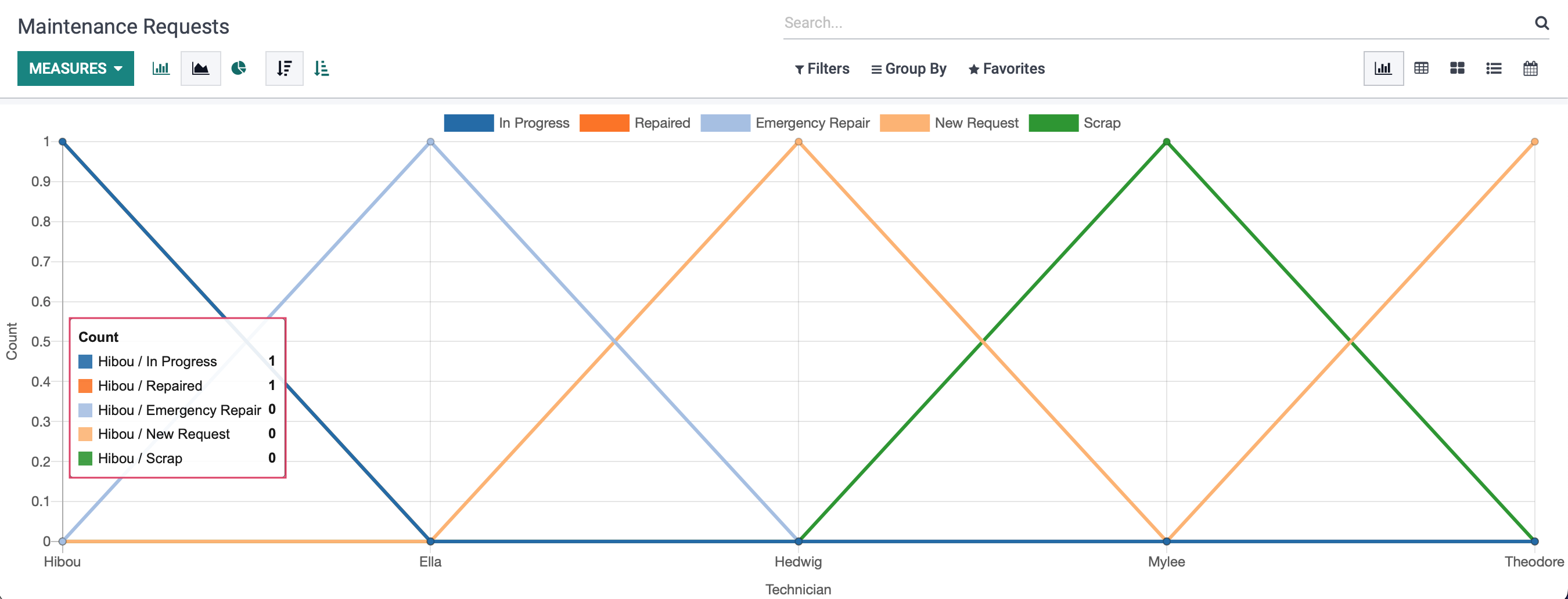
Line Chart: This will use the same Y/X axis designations as the bar graph, but will instead be displayed by lines as opposed to bars. Hovering over the technician will bring up a count of all the requests that are assigned to that technician.
Note: This chart can be further modified to view in either descending or ascending order.
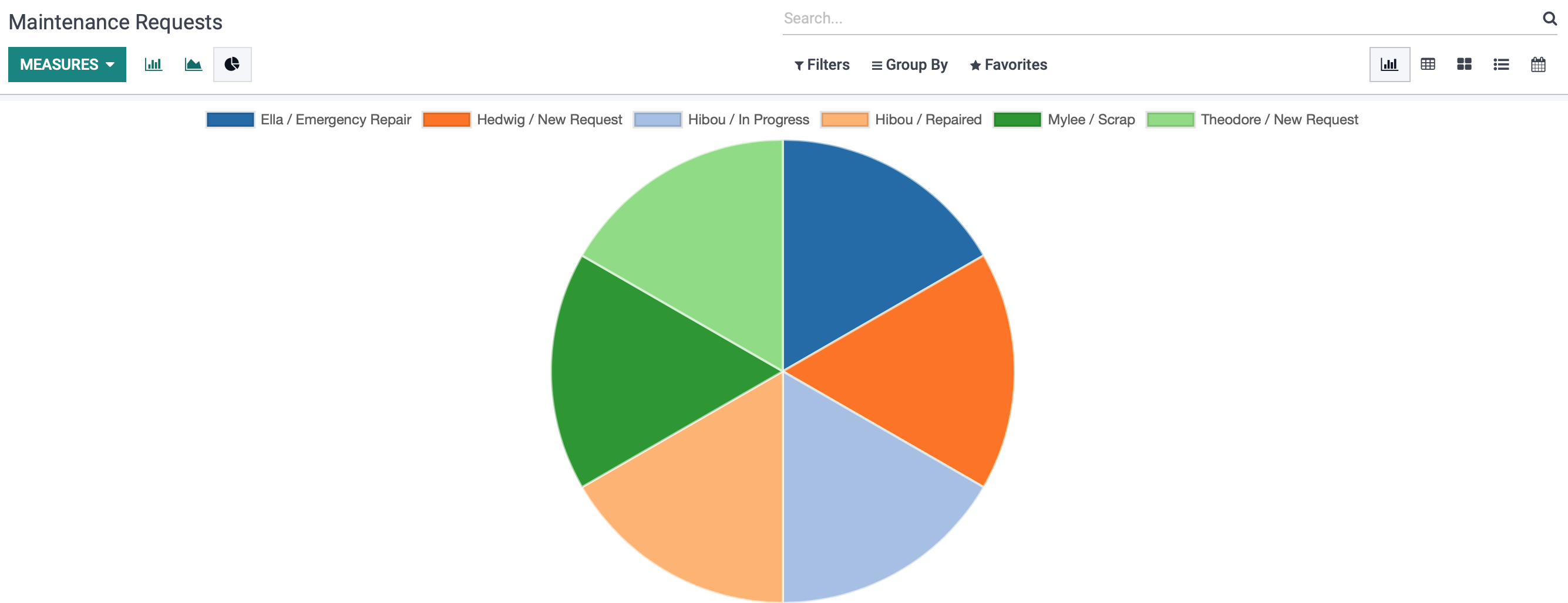
Pie Chart: This view will break the requests into "slices," with each slice being designated by the key at the top of the screen. When hovering over each slice, the count of repairs for each technician can be viewed.
To the right of the screen you will notice more options for how this data can be viewed.
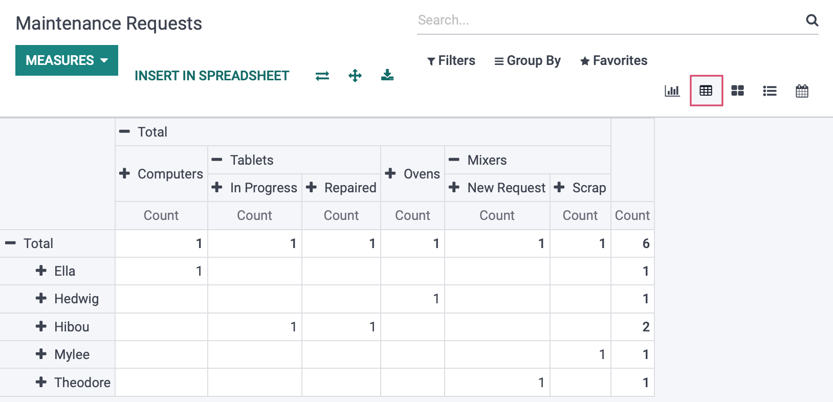
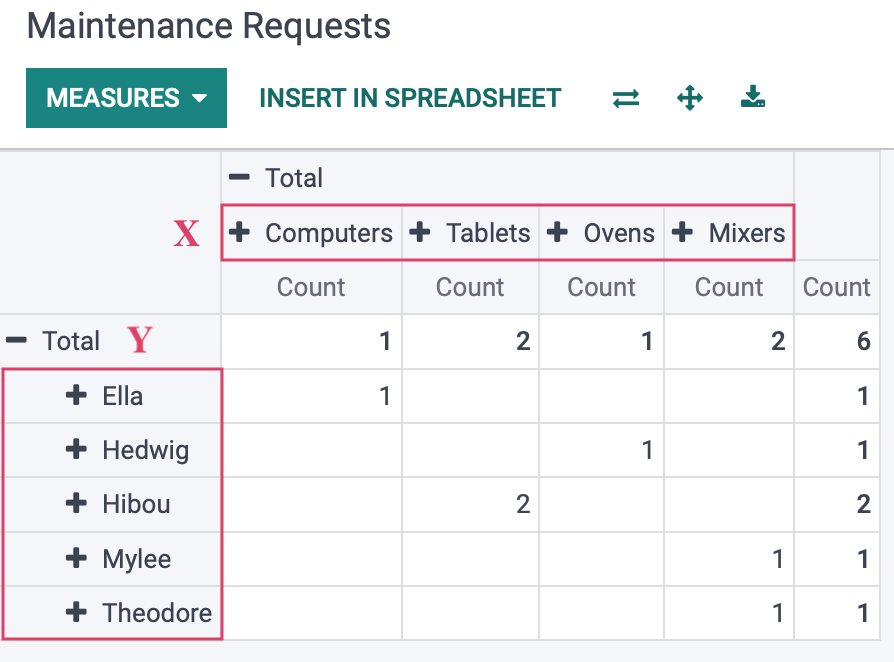
Pivot View
In this view, data will be displayed with the information filling in a table.
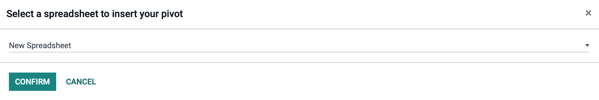
Clicking Insert in spreadsheet will bring up a modal allowing you to choose a spreadsheet to insert into your view. Click confirm when ready.
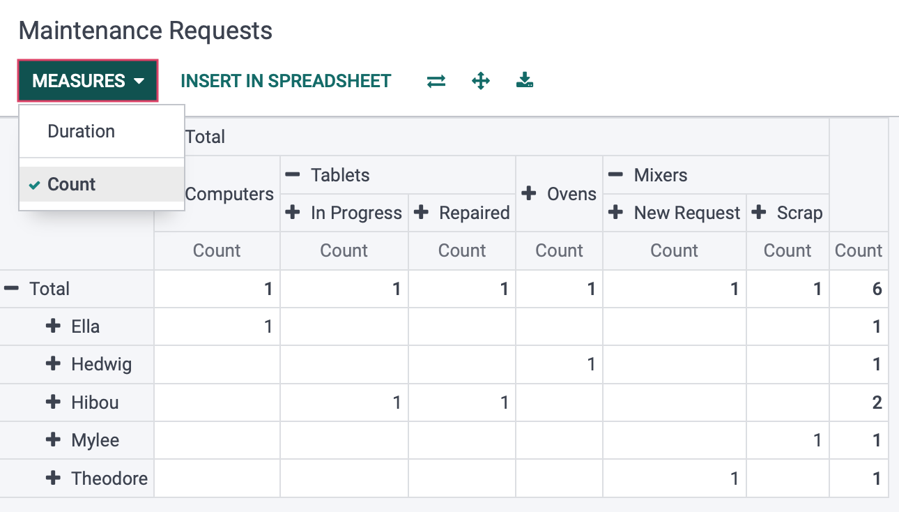
As with Graph View, you can set your measures.
Clicking on the Total will display a drop-down menu with options to set as your X and Y-axis data. In this example, we have chosen Category as our X, and Assigned To as our Y axis data.
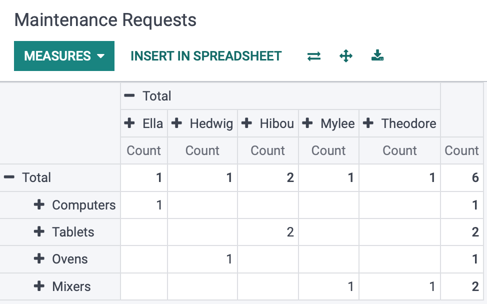
Flip Axis: Clicking this button will swap the information chosen for the X and Y axis.
Expand All: Clicking this button will expose all nested information for each item along it's axis. In the following pictures, we have selected Stage on our Tablets, which will expand to show which tablets are in what stage of repair. 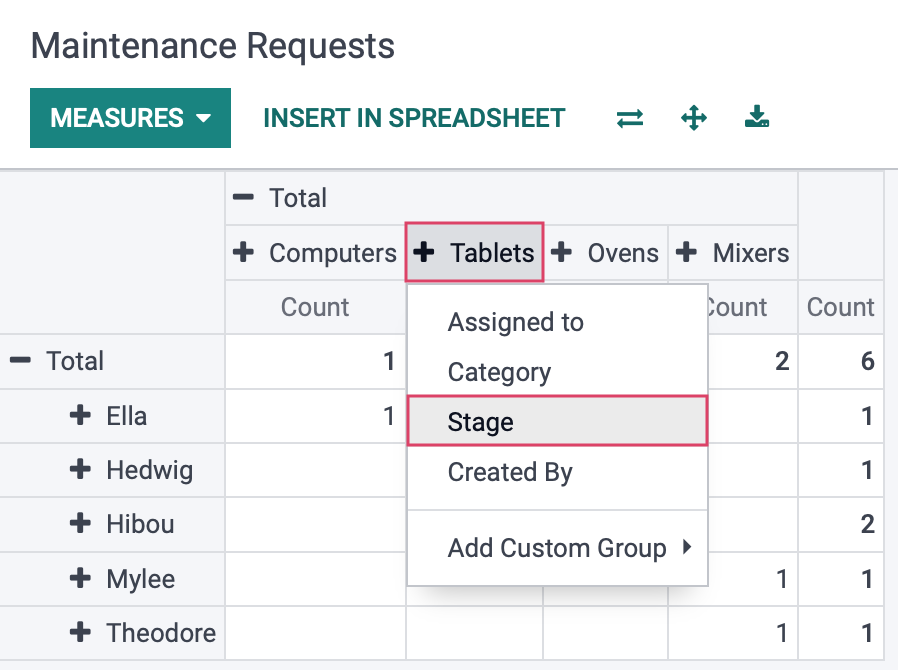
Then hit Expand All, which then displays the stage field for all pieces of equipment on the chart.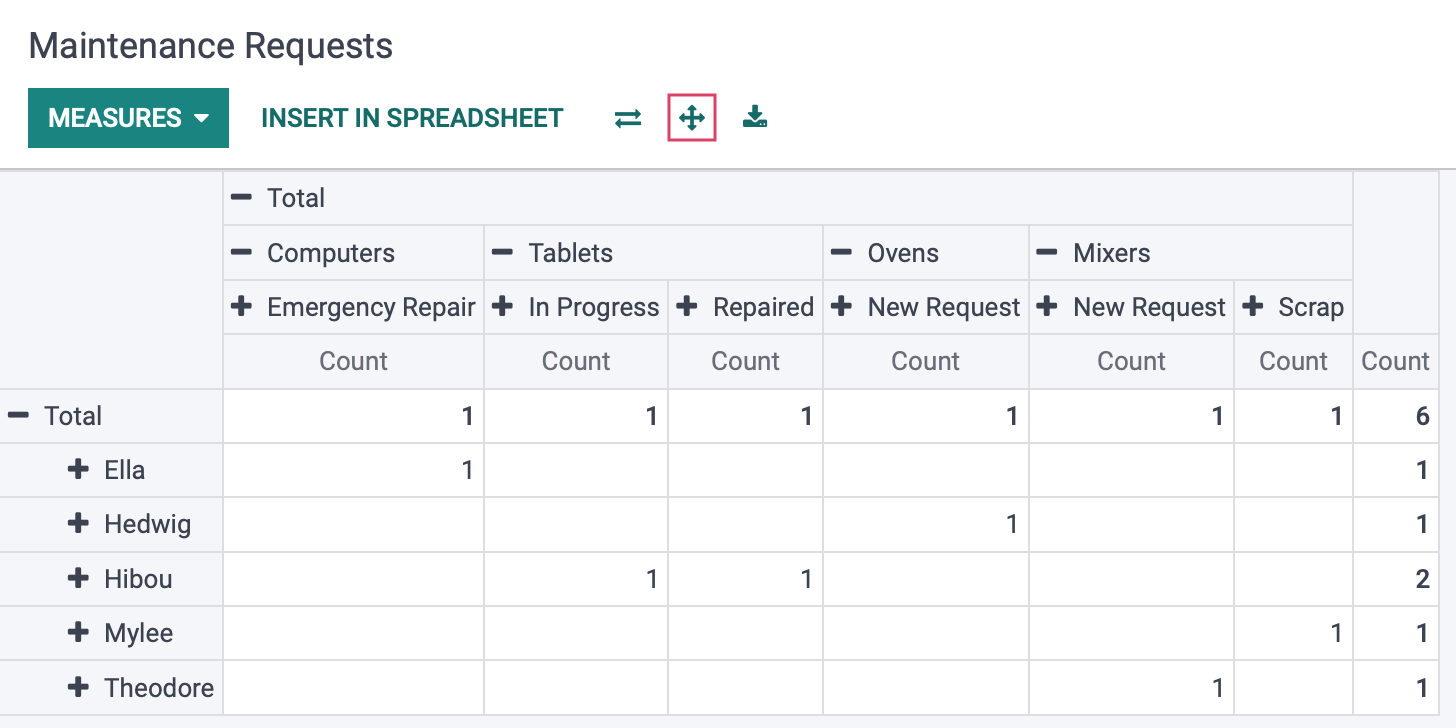
Download xlsx: Clicking this button will send a downloaded file of this table for use outside of Odoo, which can be viewed in other applications or attached in emails, etc.
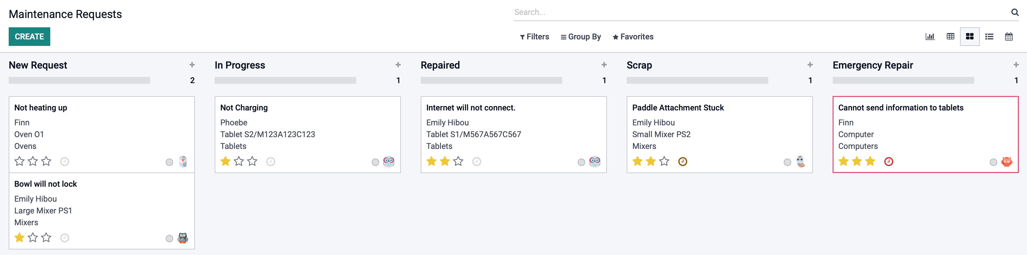
kanban View
Using the kanban view, all of your maintenance requests will be laid out in your pipeline, showing all of the stages defined by your company. The information of each request will be displayed on tiles that will show a description of the request, the piece of equipment it is for, the category of the equipment, who the request is assigned to, and the request's priority level. We will choose the selected kanban card below:
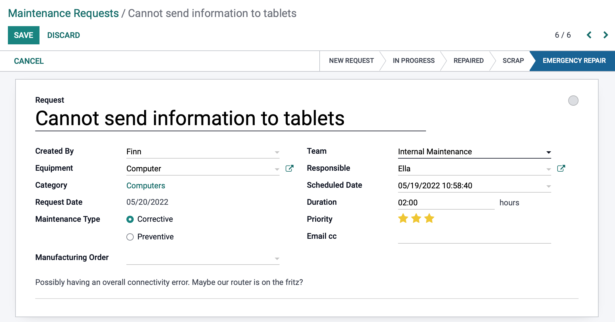
Clicking EDIT will allow you to make changes to the maintenance request. Don't forget to SAVE if any changes are made.
If you need further documentation on creating a maintenance request, or for descriptions of the fields shown below, see Maintenance Requests + Calendar for help.
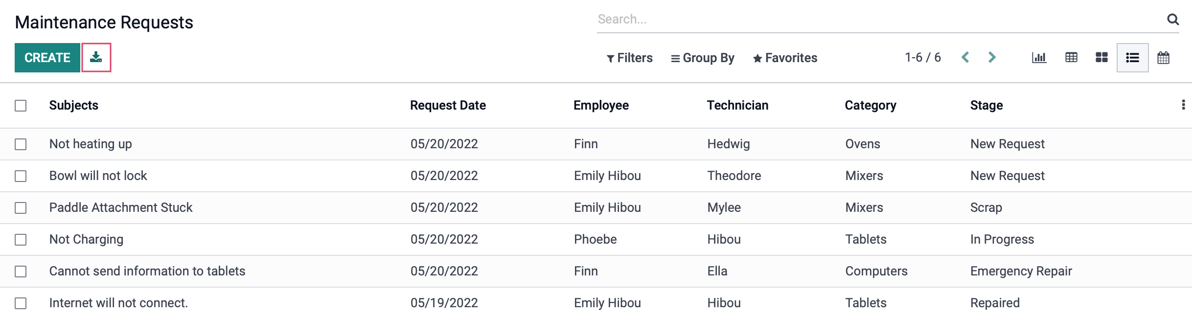
List View
Using this view will place all of your existing maintenance requests in an easy to view list, displaying important information like Employee that created the request, the Technician assigned, the catagory that the piece of equipment belongs to, as well as the stage it is in in your pipeline. You are able to click any of the Subjects to open the request template, CREATE a new request, or you can use the Export All button to convert this page into an easy to read spreadsheet.
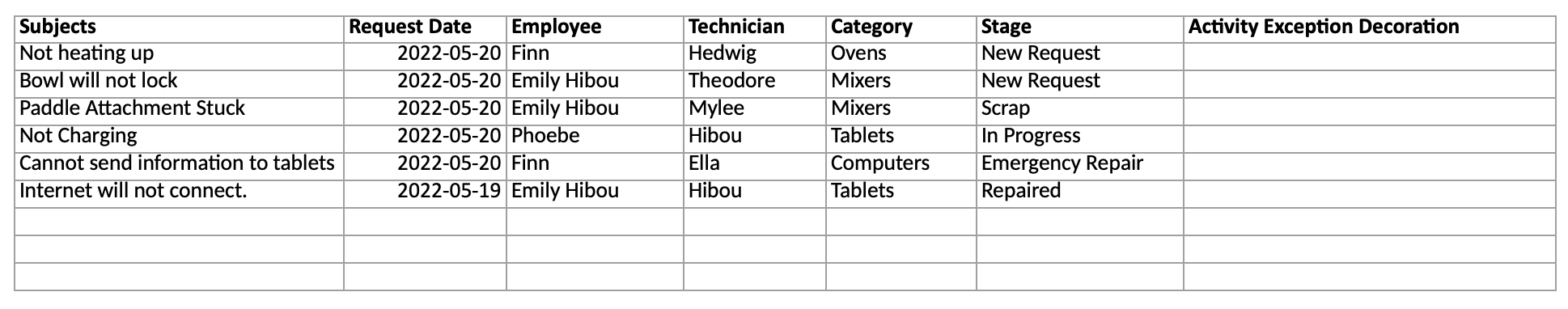
Below is an image of what the exported data looks like:
Calendar View
This is the last view option in the maintenance app. This will show you all of your scheduled requests, on the date and time that they are to be worked on. Clicking on any of the scheduled requests will bring you to the request template, where you can then make any changes that may be required.
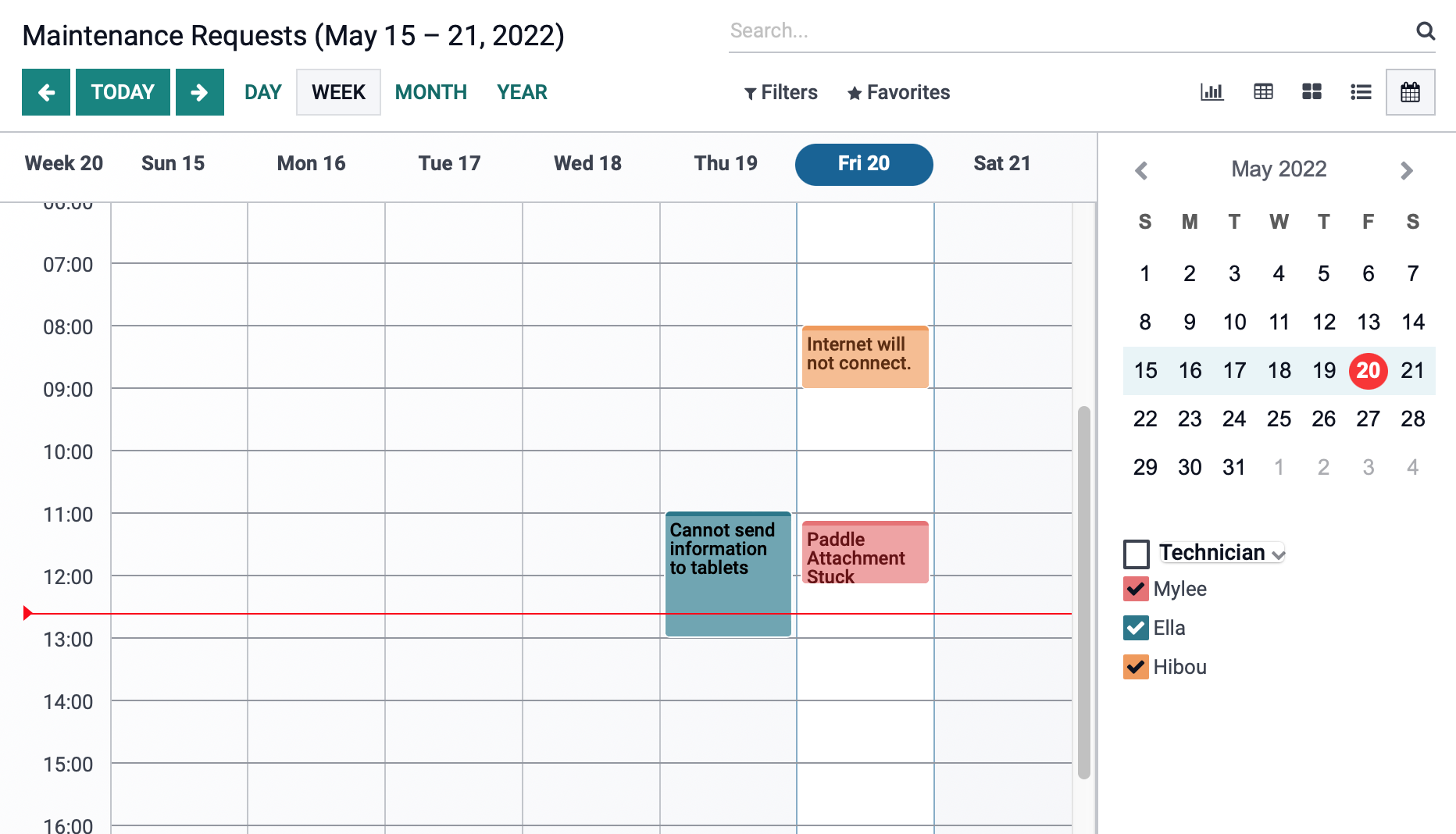
Note: When view the current week, the current day's column will be highlighted and there will be a red line showing the current time of day.