Websites... when all the set up and coordination is finalized for the functionality of a business, the work is still never done! Once you've successfully stocked your shelves and set up your PoS systems, you can't just unlock the door and hope the masses flock in. No, you need to get the word out there! More than just signs along the roads and pop ups on the internet, you need a website! Something people can browse to learn more about you and see what makes you tick! Why should they take the time and gas (good grief, the gas) to come and see your store if all they know about you is a mysterious, though eye-catching, ad. Dwindling are the days of the paper catalog as the world relies on the internet... and Odoo's got you covered with their Website application!
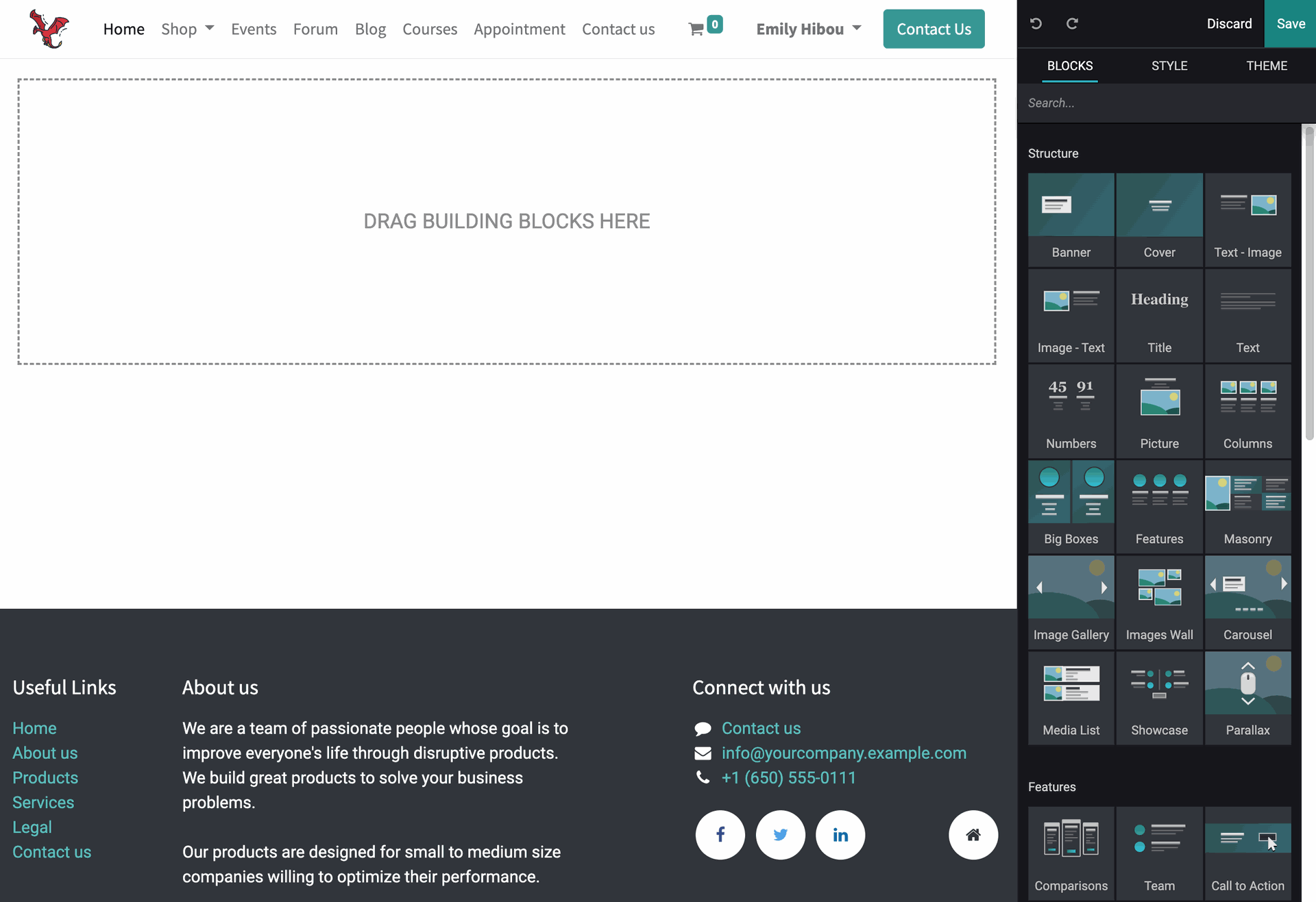
 Starting out, I'm selecting my Website application from the database and choosing the green "Go to Website" button, bringing us to the page you see here. A detailed guide to setting up the technical side of this application can be found in our Website documentation as well as a more thorough dive into what I'll be showing here today. For the purposes of this guide, I've cleared out this webpage so I'll have a clean slate to show you the process. I need a Homepage! I actually recommend starting with the Theme menu to choose your website's colors, fonts, and technical visual features. Be wary of making changes to this later as it will affect any previous customization progress.
From there we're going to return to the Blocks menu and begin building the webpage. These are organized into four categories: Structure blocks for setting up clearly defined sections for the page. Features, which are Structure blocks that are already configured. Dynamic Content are interactive blocks that can pull information from your configurations (as you go through them, you'll see what information can be linked to each). And finally we have Inner Content which are block pieces, they are meant to be placed inside of the larger Structure blocks.
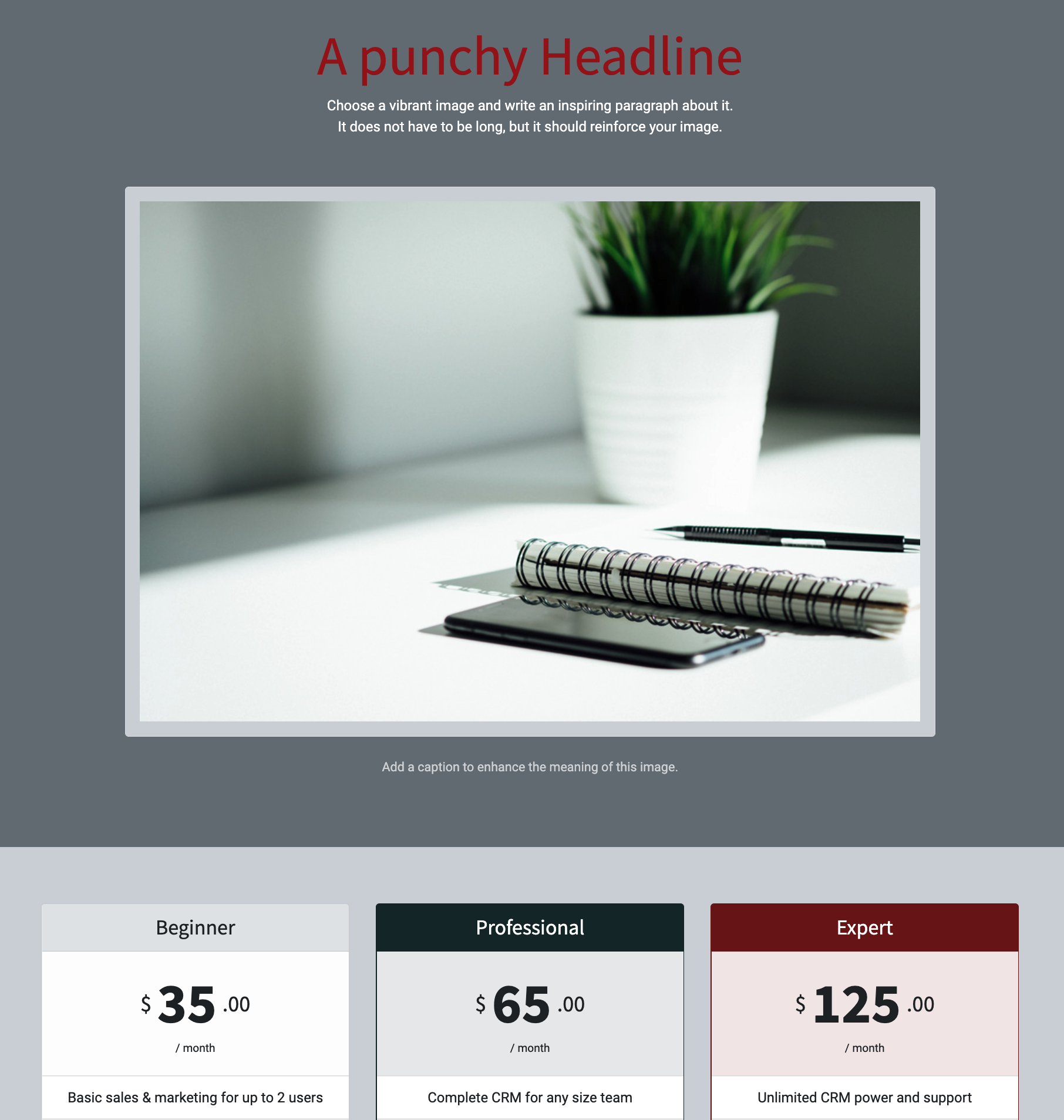
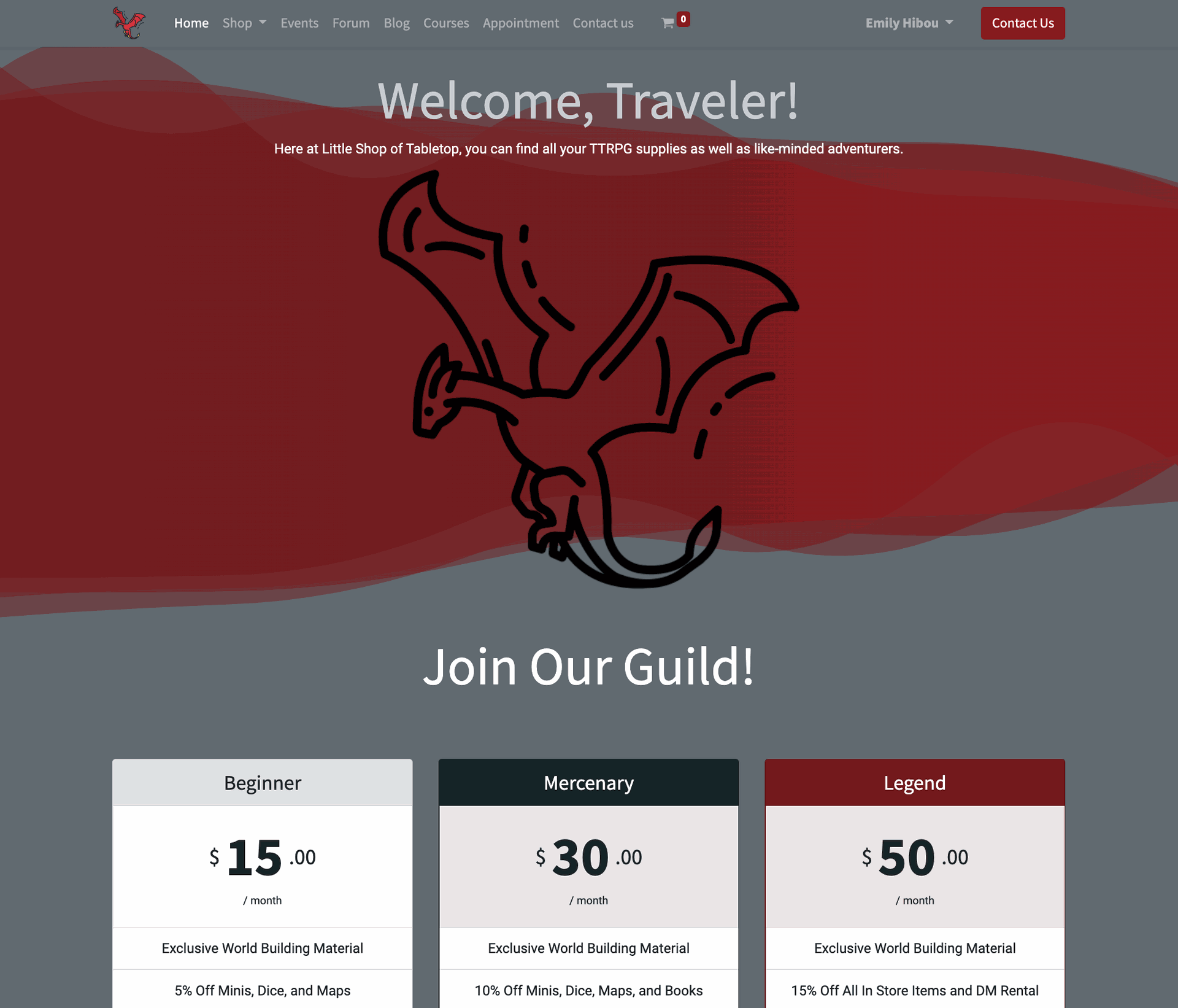
 After you've placed a few structure blocks, you'll be able to customize them with your own images and... "Punchy Headline." In this image, I've chosen the "Picture" block and placed a "Comparisons" feature block beneath it. When a block is placed and you begin clicking into them to make your desired changes, you'll note the editor menu will switch over to the "Style" section. The style section will bring up the individual pieces of a block. For example, the Picture block consists of two parts: the image and the text. If I click into the block, say to change the text, the style menu is where I would be able to change the text's font size and color. If I select the image, I'll be able to upload an image of my choosing. I can adjust the background color if I want it to be solid. Likewise, I could change it from a solid color to be an image or use one of the effect backgrounds (which is what I have used). So I've updated my information and I've punched in a bit of information about my Little Shop of Tabletop, giving me this wonderful little spread you see here.

That's all there is to it! A fun little project to really make your shop "pop" and bring in the crowd! If you have any questions or need assistance getting started, just remember... Hibou is here to help, and you can contact us using the form below!